7 Resume Headers and Sections You Need (+ Examples)

13 min read

Writing an awesome resume is hard! With a blank page staring at you, it’s difficult to even know where to begin. Don’t panic - we’re here to help. Just getting a basic structure in place makes it much easier to write the information you need to include, so start with some straightforward resume headers.
In this article, we’ll share some ways to lay out and organize your resume so that filling in the relevant information becomes much easier. We’ll also discuss the perfect resume headers and sections you need, what they should look like, and how to create resume headers that stand out.
Why are proper resume headers so important?
Hiring managers depend heavily on your resume layout to find the information that’s relevant to them, so an easy-to-read layout will greatly improve your chances of securing an interview.
In short, the more intuitively your resume is organized, the easier it is for both humans and applicant tracking systems to decipher the information and pick out the details they’re looking for.
There are certain important things to keep in mind when drafting your resume; in particular, deciding where to put information and how to label it. When hiring managers have just a few seconds to glance over your resume, it’s important that you organize it efficiently so that they can easily find the most important information.
The way that you organize the information on your resume is almost as important as the content itself. These are just some of the reasons:
Your resume will likely be scanned by an applicant tracking system
If your information is not labeled correctly, the ATS won’t know how to categorize it. Applicant tracking systems scan through your information using page markers like headers. If you have easily navigable resume headers, the ATS will have no problem parsing your information correctly and passing the relevant information on to the employer.
If your resume is not structured correctly, however, the applicant tracking system will have a hard time locating relevant information. It will present the employer with jumbled information.
In short, don't confuse the machine! A well-organized resume will make it easy for the computer to identify keywords and categorize your information, bringing you one step closer to winning an interview and landing the job.
Your resume will be scanned by a hiring manager - but only for a few seconds.
Most hiring managers are tasked with going through dozens, sometimes hundreds, of resumes in a short period of time. Because of this high demand, most hiring managers spend an average of about six seconds scanning each resume. Of course, six seconds is not even close to enough time to actually read the whole resume. So, how can we guide the eyes of the employer to the information that we absolutely need them to see? With clear and concise resume section headers, of course!
Let’s expand on the role of the hiring manager and look more in-depth at how hiring managers spend these precious six seconds analyzing each resume.
Ladders analyzed the tendencies of 30 recruiters over a 10-week period. The results speak volumes about what the most important aspects of a successful resume are (you can check out the full report here).
In short, here’s what Ladders found:
Of the six seconds that an average hiring manager spends looking at each resume, 80% of the time was spent looking at the following data points:
Name
Current position and job title / start-end dates
Previous position and job title / start-end dates
Education
When recruiters couldn’t immediately locate this information, they discarded the resume.
Example of a common human resume scan process
The following is from the study done by Ladders. It shows where the hiring managers focused their attention while reading a resume:

This study makes it clear that it’s incredibly important to have clearly labeled sections and organized information. It should take less than a second for a hiring manager to locate any of the above information. If the information can't be immediately located, it may as well not be there.
To make you seem professional
Your resume is the first impression you’ll make on the hiring manager, so it needs to look smart and professional. You could present a long rambling essay on your experience and skills, but what they’re expecting, and what looks infinitely more professional, is a well-presented, concise summary of your suitability for the role.
A well-laid-out resume shows that you know what’s expected and can present an attractive, structured, and relevant document that makes a compelling argument for your candidacy. Resume headers play a key role in achieving that.
Now that we've established why concise resume organization is essential to success let’s dive into the details of how you can effectively use resume headers to arrange your resume.
Headers for your resume
First, determine which information is likely to be most important to the employer. Usually, it’s things that prove your suitability for the role, such as experience, skills, and qualifications. Then, clearly label that information and format it in an easy-to-read manner. The most important sections include:
1. Resume title and header section
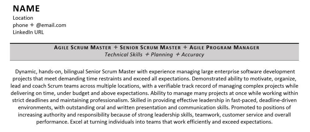
Let’s start with the first of the resume headers, the header for your entire resume. This header (also called the resume title) is going to be more robust than the others as it serves as an overall introduction to the resume and provides some basic personal information about you. Position it at the very top of your resume. It doesn’t need to take up much space - a couple of lines max should suffice.
The essentials that you absolutely must include in your professional resume header are:
Name: Sounds obvious, but don't forget it! Make sure your name stands out. Put it in bold or in a larger font than the rest of your resume and place it at the top of the page. It should take less than a second to find your name on your resume.
Email address: Chances are, this is how the employer will choose to contact you to progress your application. Make sure that you use a professional email address - this is one of the very few occasions when it’s OK to use a hyperlink in your resume. The same principle applies here: make sure that your email address can be located in less than a second when glancing at your resume. Hiring managers expect your contact details to be at the very top of the resume, with your name.
Phone number: The phone is the second most popular means of communication for hiring managers. As with the other two essentials, make sure this contact information is super obvious and easy to locate. If you’re job searching internationally, don’t forget to include the dialing code, too.
The following details are optional but really helpful if you've spent time optimizing them - they can add that little extra zing that other candidates may not provide.
Personal website: Depending on the industry you’re going into, a personal website can give you a huge leg up on the competition and help your resume header to stand out. For example, an Artist or Graphic Designer can use a personal website to demonstrate their talent and past work. Similarly, a Web Developer or anyone else who has a tangible portfolio of work can leverage a portfolio website to show off their work.
LinkedIn: Most hiring managers will check your LinkedIn profile so, if you have one, make sure that you include a link. You can check out our post on how to include a LinkedIn URL on a resume. If you don’t have a LinkedIn profile yet, it’s worth setting one up to support your job search. It’s free and could help you to land a job quicker!
2. The resume summary

Including a professional resume summary will help you to catch the attention of a hiring manager. You don't need to label it as long as you stick to paragraph form. If you do wish to give it a header, something simple like “Professional Profile” or “Professional Summary” will do the job. There’s an example above to give you inspiration on how to format the resume summary. As the first information that a hiring manager will read about you, it’s important that this section is jam-packed with keywords and reasons for them to hire you.
3. Core competencies
A core competencies section is very useful for both highlighting keywords and skills relevant to the role and capturing the attention of a hiring manager with snappy, relevant bullet points. You could choose a header that says “Core Competencies”, “Key Skills,” or “Areas of Expertise”. For more information, read our post on choosing the right core competencies for your resume.
4. Work Experience
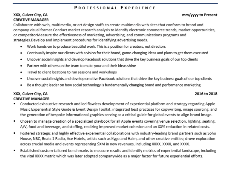
The work experience section should take up the bulk of your resume. The header could read “Career Summary”, “Work Experience,” or “Professional History”, for example. You could add “Key Achievements” subheadings for each job, too, to really highlight the value you bring to an organization.
You may want to create a separate header for voluntary work, although it’s perfectly fine to include volunteering within your career history if you prefer - particularly if it will cover a career gap.
5. Education
This is another important category that’s often part of the 6-second scan. A simple, one-word header like “Education” or “Qualifications” is perfect. You can also be more specific and divide it further into sections like “Certifications” or “Professional Development." Key information to add within this section is the level of qualification, subject title, and year of completion.
This post has more details on listing education on a resume.
6. Technical Skills
Having a technical skills section is optional if your industry doesn't require a lot of technical skills - but we don't recommend completely eliminating any valuable and relevant ones that you have. If you don’t feel a whole Technical Skills section is worth it for the roles you’re aiming at, you can include the skills in your Core Competencies section instead.
However, if you’re applying in an industry where specific “hard” skills are valued, it’s helpful to further divide your skills into multiple sections. For example, you can have an “IT Proficiency”, “Languages”, or “Technical Skills” section to directly address the requirements of the job listing.
For more information on drafting the perfect skills section, check out our blog post that covers what skills you should put on your resume.
7. Achievements
Ideally, you’ll list career-related achievements as part of every job you include. If, however, you feel a bit light on achievements, or you have a handful of knockout achievements that you really want to highlight, or you have some personal achievements that don’t sit comfortably anywhere else on the resume, you may want to create a separate section headed “Achievements.” This will draw the readers’ eye to details you’re particularly keen to show off, whether that’s a professional achievement, such as saving the company $5 million by developing a new system, or a personal achievement, such as raising $10,000 for a relevant charity by completing an ultramarathon.
Personal achievements should be positioned at the end of the resume, whilst professional achievements should be positioned much more prominently. Bear in mind the rule that the most critical information that you want to convey to a recruiter should be clear within the top third of the first page.
8. Optional sections
These other resume header examples are not strictly necessary unless you want to highlight a personal selling point that is highly relevant to the role you’re applying for. You could consider including:
Affiliations
Projects
Resume headers examples
When you’re sitting down to write your resume and are faced with a blank page, you can use these examples of resume headers to get you started:
Main resume header and contact details
Professional Profile
Core Competencies
Career History
Qualifications
Technical Skills
Personal Achievements
You may not need all of them, but they will guide your thoughts and your writing so that you can get the key information down on the page before you tweak and tailor it to perfectly fit the role you’re applying for.
How to style your resume headers
Good resume headers stand out from the rest of the text but don't go over the top. A larger and bolder font will do the trick. You may also want to consider underlining headers in a resume to separate them from the body of the text - although not in such a way that they’re mistaken for hyperlinks. You've done a good job if it’s clear at first glance where the headers are located.
Make the text in the headers short and specific. Don't get too creative with these section headers, either. They're signposts to identify how you've organized your resume, they shouldn’t distract the reader from the valuable content within each section!
The following is a good example of a resume header format by the professional writers here at ZipJob:

Creative resume headers
While we’re all in favor of creativity and individuality, we really can’t recommend using creative headers. Whether that’s in terms of wording (such as “What you need to know about me”) or format (such as graphics and text boxes), creative headers are generally not the way forward. The keys are to remain professional, to make the reader’s job easier by giving them what they expect, and to present a resume that is scanned accurately by an ATS.
Should my resume have headers and footers?
So far in this article, we’ve focused on section headings for your resume. But what about using the Header and Footer functions in Word? It’s tempting to use the Header function for your name and contact details and the Footer function to duplicate the information on subsequent pages, but we’d strongly advise against it. Some ATS can’t read the information in headers and footers, so although a human will be able to see the details as you intended, the information may get missed when your resume is scanned.
When the ATS misses contact information in your resume, it could lead to your resume being rejected altogether.
Use headers as signposts to get the YES you’re waiting for
The headers on your resume are a guide for the hiring manager and applicant tracking systems to find your information. Labeling and placing resume headers correctly is essential to sending the message you want to send and standing out from the crowd. With the correct resume header format, your resume is one step closer to landing you that elusive interview.
We wish you lots of luck in your job search. When you’ve written your resume, why not submit it for a free review from our team of resume experts?
Recommended reading:
This post was originally written in 2016 and was updated in 2021 and 2023.

Written by
Jen David, Editor & Content Writer, Jen David, Editor & Content Writer
Jen David has been writing CVs since 2010 and is the founder of CV Shed. She has worked with clients in numerous industries and at all stages of their careers, from students through to senior executives of global businesses. She loves producing polished, focused CVs that appeal to both human recruiters and applicant tracking systems, enabling her clients to take the next step in their careers. Jen has written and edited numerous articles for publication on industry-leading job boards.
